Trace Analysis
The collected traces are, by default, saved in the dataset folder located in the same directory as the current Jupyter notebook. The filenames are timestamped, for example: 20250519101918.zarr.
We use the scarr library to analyze waveforms. For installation instructions, refer to: Install SCARR
Run scarr for analysis
Insert and execute the following code snippets in the Jupyter notebook to start analyzing the trace.
# Replace this with the trace file you collected
trace_path = r'./dataset/20250519122059.zarr'
from scarr.engines.cpa import CPA as cpa
from scarr.file_handling.trace_handler import TraceHandler as th
from scarr.model_values.sbox_weight import SboxWeight
from scarr.container.container import Container, ContainerOptions
import numpy as np
handler = th(fileName=trace_path)
model = SboxWeight()
engine = cpa(model)
container = Container(options=ContainerOptions(engine=engine, handler=handler), model_positions = [x for x in range(16)])
container.run()
View Results
After executing the code above, the trace should be analyzed and the key extracted.
candidate = np.squeeze(engine.get_candidate()) # get_candidate retrieves the guessed values of the key bytes
' '.join(f"{x:02x}" for x in candidate) # Print the guessed key
This will print the extracted key

In the waveform acquisition chapter, the key used was 11 22 33 44 55 66 77 88 99 00 aa bb cc dd ee ff, which confirms the key has been successfully extracted.
import random
import time
from cracknuts.cracker import serial

cmd_set_aes_enc_key = "01 00 00 00 00 00 00 10"
cmd_aes_enc = "01 02 00 00 00 00 00 10"

aes_key = "11 22 33 44 55 66 77 88 99 00 aa bb cc dd ee ff"
aes_data_len = 16

...
Verify the Result
We can verify the analysis result by executing the following code to check the correlation of the guessed key byte 0:
result_bytes = np.squeeze(container.engine.get_result())
result_0_bytes = result_bytes[0] # Get correlation values for byte 0
row_max_indices = np.argmax(np.abs(result_0_bytes), axis=1)
row_max_values = result_0_bytes[np.arange(result_0_bytes.shape[0]), row_max_indices]

top10_row_indices = np.argsort(np.abs(row_max_values))[::-1][:10]

for rank, row in enumerate(top10_row_indices, 1):
    col = row_max_indices[row]
    val = row_max_values[row]
    print(f"Candidate {rank}: 0x{row:0X}, correlation: {val}, peak position: {col}")
The code above will print the top 10 candidate keys with the highest correlation:
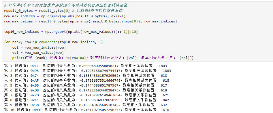
The results you get might differ, as long as the top one is correct, the analysis is valid.
Here you can see that byte 0 has the highest correlation with 0x11, confirming the correctness of the extracted key.
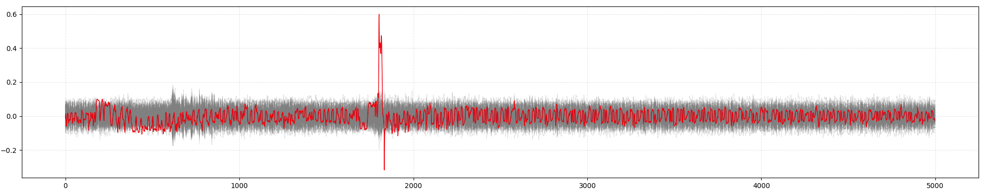
You can also visualize the correlation curve by running the code below:
import numpy as np
import matplotlib.pyplot as plt

def plot_correlation_peaks(bytes_index, the_key):

    x = np.arange(0, 5000)

    fig, ax = plt.subplots(figsize=(30, 4))

    for i in range(256):
        if i == the_key:
            continue
        ax.plot(x, result_bytes[bytes_index, i, :5000], color='gray', linewidth=0.5, alpha=0.3)

    ax.plot(x, result_bytes[bytes_index, the_key, :5000], color='red', linewidth=1.0)

    ax.grid(True, linestyle='--', alpha=0.3)
    plt.tight_layout()

    plt.show()
plot_correlation_peaks(0, 0x11)
This will produce the following graph, where the correct key's correlation curve shows the most distinct peak:
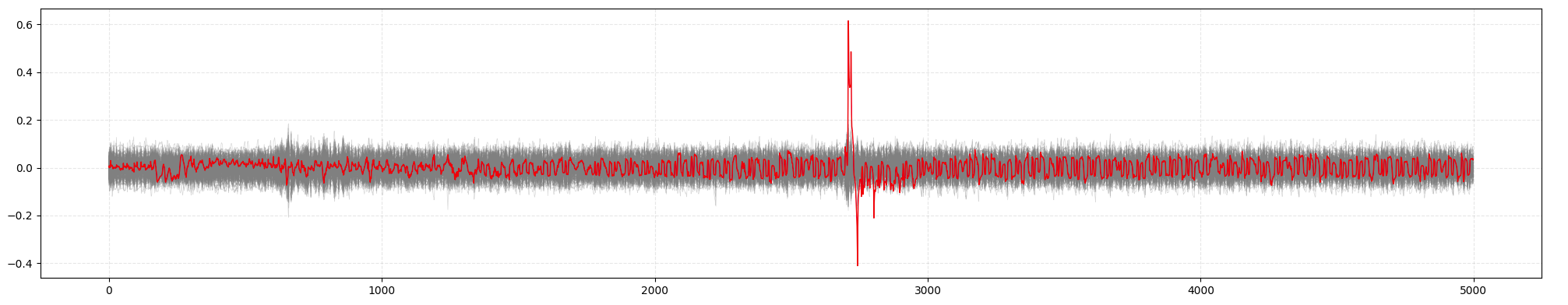
You can repeat the process for other key bytes:
plot_correlation_peaks(1, 0x22)
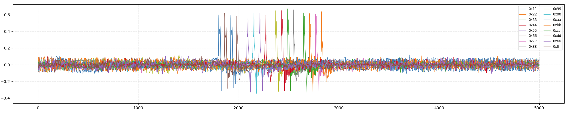
Now let’s plot the correlation curves for all 16 correct key bytes to observe their timing:
import matplotlib.pyplot as plt

x = np.arange(0, 5000)

fig, ax = plt.subplots(figsize=(30, 4))

ax.plot(x, result_bytes[0, 0x11, :5000], linewidth=1.0, label='0x11')
ax.plot(x, result_bytes[1, 0x22, :5000], linewidth=1.0, label='0x22')
ax.plot(x, result_bytes[2, 0x33, :5000], linewidth=1.0, label='0x33')
ax.plot(x, result_bytes[3, 0x44, :5000], linewidth=1.0, label='0x44')
ax.plot(x, result_bytes[4, 0x55, :5000], linewidth=1.0, label='0x55')
ax.plot(x, result_bytes[5, 0x66, :5000], linewidth=1.0, label='0x66')
ax.plot(x, result_bytes[6, 0x77, :5000], linewidth=1.0, label='0x77')
ax.plot(x, result_bytes[7, 0x88, :5000], linewidth=1.0, label='0x88')
ax.plot(x, result_bytes[8, 0x99, :5000], linewidth=1.0, label='0x99')
ax.plot(x, result_bytes[9, 0x00, :5000], linewidth=1.0, label='0x00')
ax.plot(x, result_bytes[10, 0xaa, :5000], linewidth=1.0, label='0xaa')
ax.plot(x, result_bytes[11, 0xbb, :5000], linewidth=1.0, label='0xbb')
ax.plot(x, result_bytes[12, 0xcc, :5000], linewidth=1.0, label='0xcc')
ax.plot(x, result_bytes[13, 0xdd, :5000], linewidth=1.0, label='0xdd')
ax.plot(x, result_bytes[14, 0xee, :5000], linewidth=1.0, label='0xee')
ax.plot(x, result_bytes[15, 0xff, :5000], linewidth=1.0, label='0xff')

ax.grid(True, linestyle='--', alpha=0.3)
ax.legend(loc='upper right', fontsize='small', ncol=2)

plt.tight_layout()

plt.show()
You can now observe the correlation coefficients for all 16 key bytes:
Congratulations! You’ve now completed the basic usage of CrackNuts. For more features and tutorials, please refer to other chapters.